


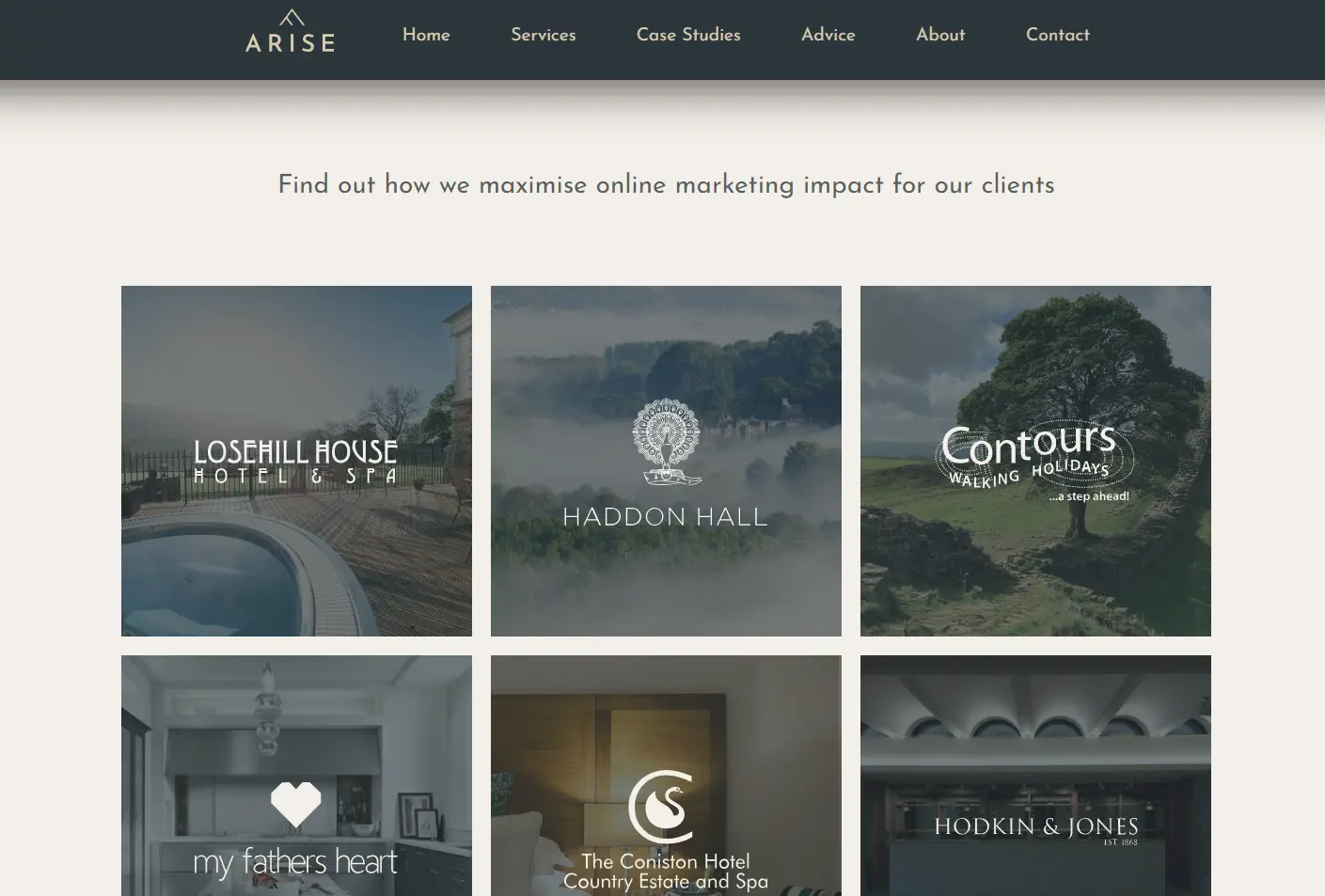
When it comes to designing a website that makes business better, the navigation menus are a fundamental element. If not considered properly this can quickly annoy customers, hurting your brand and likely losing their custom.
Navigation deals with a few basic aims that any website should be facilitating…
How a visitor finds what they’re after
How a visitor gets to where you want them to go
Types of navigation
While there are many flavours of navigation available, we’ll consider 3 common options. Namely a standard menu, dropdown menu, and the elusive hamburger menu.
Standard Menu
Navigation in its simplest form, a list of links to all the key pages, usually across the top of a website.
Dropdown Menu
A step up in complexity from the standard, the dropdown menu is much better suited to sites that need lots of pages and therefore a more complicated information architecture with perhaps 2 or 3 levels.
Again, the menu tends to be laid out across the top of the page, and the user can hover or click on each menu option which then expands to reveal a list of related options below it.

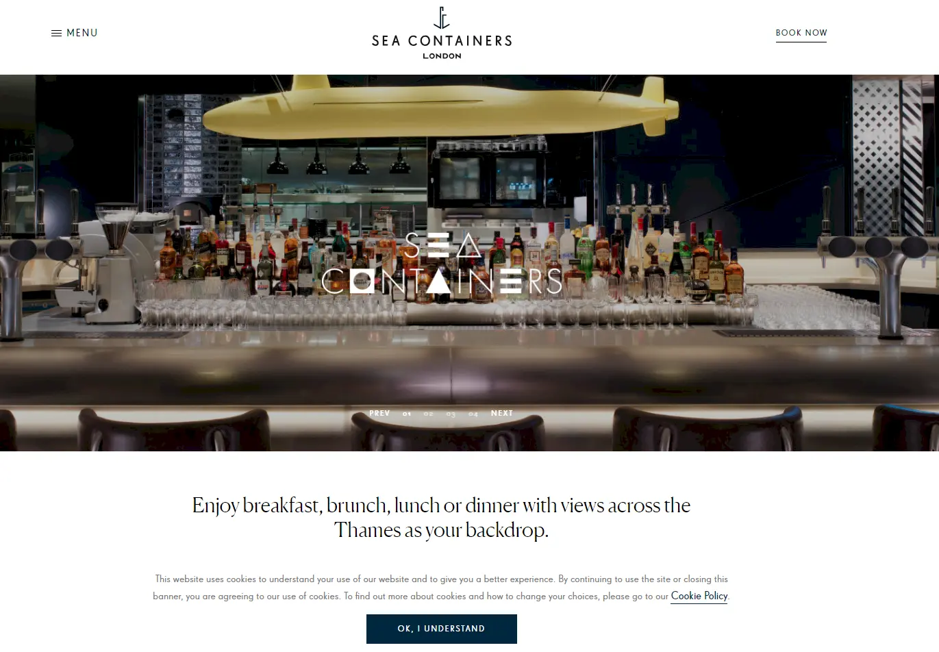
Hamburger Menu
As tasty as it sounds, this doesn’t refer to your fast food choices. The hamburger refers to the ≡ symbol (the three horizontal lines), and while that symbol is being used to signify a list of links, it gets its delicious name from the three layers shown—bread, meat, bread.
In its most common form the navigation tends to be entirely hidden from view to begin with, the hamburger icon shown in its place. Clicking on that icon then reveals all the available navigation options.
Which option is most usable?
While it depends on your situation – the depth of the information architecture on your site, and the tasks you want your user to perform, on the whole research shows that hamburger navigation causes some big concerns from a usability perspective.
User experience experts the Nielsen Norman Group go into great depth on the subject, but the summary of their findings is…
“Discoverability is cut almost in half by hiding a website’s main navigation. Also, task time is longer and perceived task difficulty increases.”
Remember our navigation aims—ensuring a visitor finds what they’re after, and ensuring visitor can get to where you want them to go. “Discoverability” sums up these aims neatly, and that discoverability needs to be a key aim for your website.
Example scenarios
Let’s say you’re responsible for the the website of a beautiful boutique hotel in the English countryside.
With the dropdown
Jennifer is looking for somewhere to spend a romantic weekend away with her husband Jeff and lands on your website. With the dropdown navigation she glances over the menu, hovering her mouse over a clearly displayed “Stay” option with interest. She sees some options appear below: Our Rooms, Pricing, Spa Breaks, Romantic Breaks… Bingo. Another click and she lands quickly at the information tailored to her needs.
With the hamburger
Now, let’s suppose you opted for the hamburger approach. Jennifer lands on your home page, looks around a little, let’s say she recognises the hamburger symbol and clicks it. The full list of pages is displayed, including everything from weddings, to Christmas events to corporate functions. Poor Jen crawls through that full list to find what she’s after.
Hamburger navigation has downsides
As Jennifer’s example shows, the hamburger approach has its downsides. We believe it sacrifices 3 important things…
Scannability – Jen couldn’t simply cast her eyes across the page and find what she’s looking for without first recognising and interacting with the hamburger symbol.
Familiarity – You could say that familiarity is the bedrock of usability. Today the majority of people know how to use a website and have learnt common patterns, think of this as muscle memory. Probably the most familiar way to navigate a website is via links across the top of the page. Although the hamburger is becoming more common, it is a relatively recent phenomenon and therefore that muscle memory isn’t quite as ingrained.
Simplicity – With the dropdown menu Jen hovered over Stay and saw the items that relate to a stay at the hotel. But with the hamburger she was presented with everything (including options that weren’t relevant to her at that moment). This overshare increases “cognitive load”. Think of it this way, if the user has 3 options to choose from at a time that’s easy to take on board, give them a 100 and they’ll likely be overfaced, lose patience, and go elsewhere.
In defence of the hamburger
Though we’ve clearly shown the downsides of the hamburger menu, it’s not all bad and depending on your situation and your aims, can be used well.
It’s handy for mobile and smaller screens. A clear benefit of the hamburger approach is that it saves space (which is at a premium on mobile), and it tends to be more commonly used on mobile.
As previously mentioned, this approach saves space and gives a minimal feel. If you value looks over usability, or are dead set on a stylish, chic image, this approach is a fair choice.
It’s becoming more common. Although it still lacks familiarity, the hamburger icon is becoming more and more present, building that collective muscle memory. Always bear in mind your target audience though, will they be familiar with this approach?
The best navigation choices
Your setup will be unique, different information, different aims, a different audience, but here’s a rule of thumb to help you make the best of your site’s menus…
Use a standard menu – if you have a simple site with a limited number of pages
Use a dropdown menu – for a more complex site with more information
Use a hamburger menu – when aesthetics rule, or you have a savvy target audience
In our experience, and at this time, in most cases the dropdown navigation fits best, and with some clever design can be given the aesthetic finesse that the hamburger enjoys. Every website project we undertake is of course different, and we take time to consider the best navigation option for the client’s specific needs.
Be sure to consider whether you’re getting the best results from your website, think through some likely scenarios and make sure your users can get from A to B with relative ease. If you spot issues with something as fundamental as your navigation, it’s a wise investment to put that right.