


This article was originally published as part of Hotel Designs’ Guide to Hotel Design on 19th June 2019.

Over the past decade, smartphones have quickly become a constant presence in everybody’s pocket. Not to mention the advent of the smartwatch and smart TV, plus the array of different desktop screen sizes to choose from. The web can be browsed in all shapes and sizes.
But despite this increasing bias towards smaller screens and the presence of so many different screen sizes, working on our large laptop or desktop screens as marketers, managers and designers, we’re in danger of becoming stuck in a desktop mindset, neglecting to see and experience our establishments the same way that our customers do.
Because of this we find that many critical areas of hotel websites, such as viewing room details, buying vouchers, or placing bookings are particularly painful for smartphone users, who are often the ones who appreciate a quick and painless process the most.
Where are we now?
To get a picture of where things stand now, we investigated the statistics of a number of hospitality businesses, particularly looking at the split between mobile, desktop and tablet visits over the past 3 months. Unsurprisingly we found that desktop use is eclipsed by mobile and tablet, with mobile accounting for the largest portion of users.
How do we make sure we offer potential customers a smooth online experience? There’s no single solution that ensures this, but the following tactics in combination will.
Adopting a responsive layout
When mobile websites first came around, many took the approach of creating an entirely separate mobile optimised website. This tactic soon fell out of favour (it causes a lot of duplication and generally isn’t cost effective), and responsive web design emerged as the best solution.
If you’re unfamiliar with the term “responsive web design” it refers to a single website layout that responds to the device it’s viewed on, with the layout and design adapting for best use.
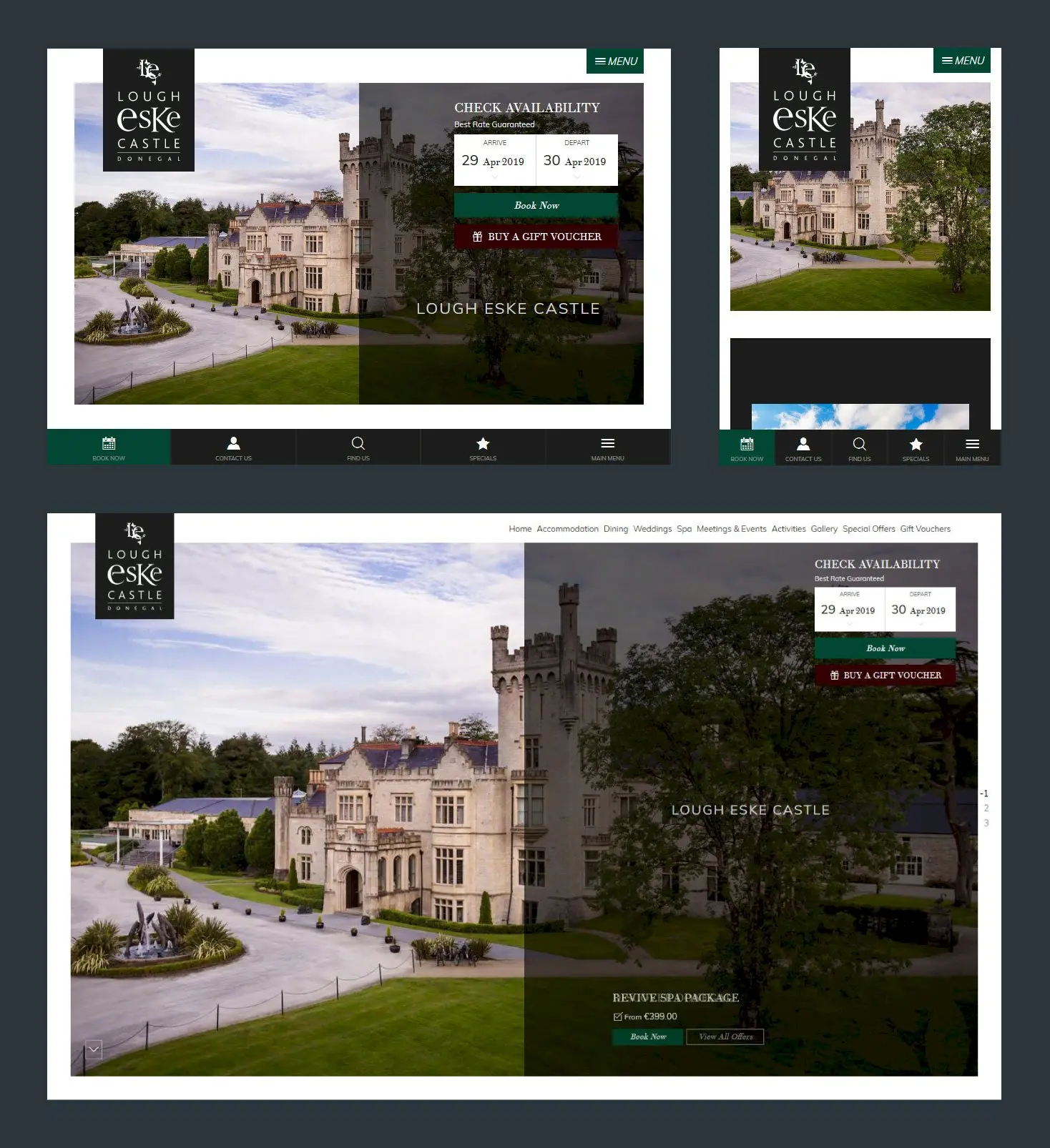
Taking this approach is much more effective than simply considering a large desktop view and a small mobile view. It applies the mindset of “the layout should work at any screen size”, meaning it’s a good long term solution for the future, allowing your site to be ready for the development of the next new gadget on which you can browse the web.
But whether you know the term or not, responsive layouts are nothing new. If your website isn’t responsive, if the layout doesn’t adapt, it’s time for a major review.
Mobile-first design
Mobile-first design is an approach that goes hand-in-hand with responsive layouts. By starting the design process by looking at the smallest screens, you ensure that the important elements are prioritised and unnecessary features are stripped out. Additional design features can then be considered as the display adapts for larger screens.
Testing
Taking 5 minutes to test your site on mobile is perhaps the best first step you can take. Get your phone out and load up your hotel’s website, how does it look? Try to make a booking, how does that go? Testing like this can highlight some quick wins for you and help iron out the obstacles that stand in the way of potential customers.
It’s also worth thinking about your target audience, the situation they’re in, their barriers to booking, and the tasks they might want to accomplish on your website. Perhaps it’s as simple as finding out if dogs are allowed, is it easy enough to find that information on your site when viewing from mobile screens?
What happens when we don’t do this?
If your website is not well optimised for use on mobiles then it’s clear you’ll be frustrating more than half of your potential customers, which can be damaging for your brand.
It also hurts your pocket. Much of the time and money you already invest into marketing is effectively wasted if users struggle to book.
For example, let’s take a look at the website of Cave Castle Hotel & Country Club, where unfortunately some big problems lie…
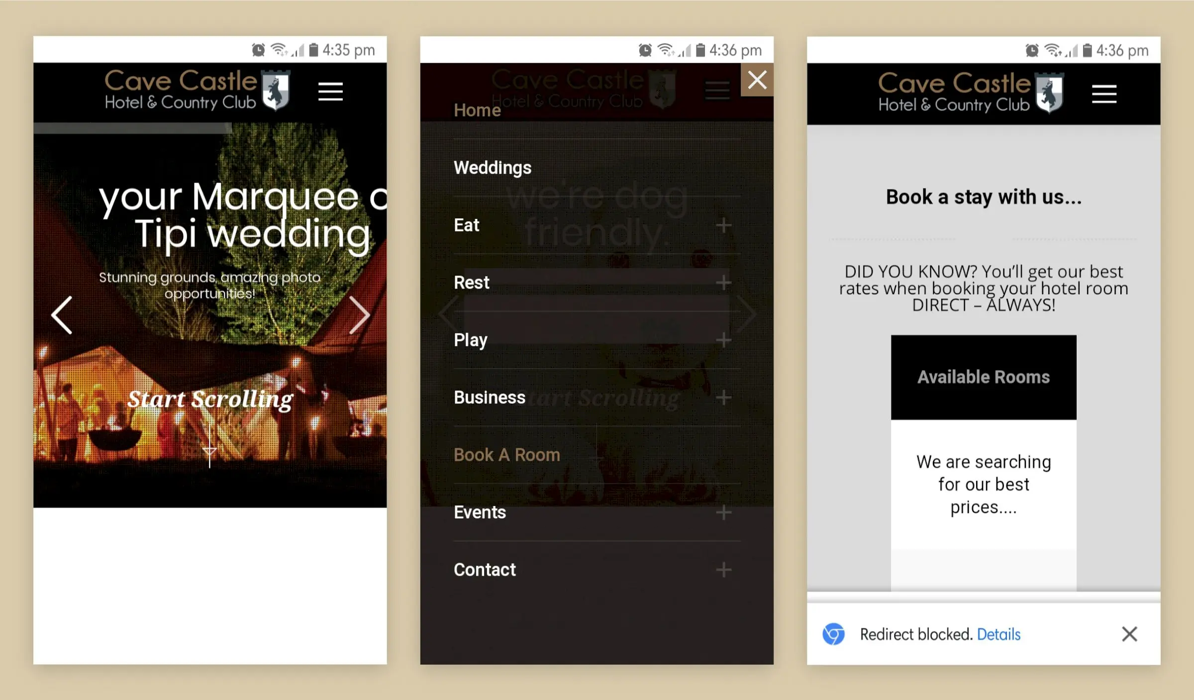
- First of all, the home page is a little slow to load, with large images taking up precious 3G bandwidth, and the content here is cropped off the side of the screen, which looks odd. There’s no obvious “Book Now” call to action either.
- Next by hitting the navigation symbol at the top of the page (which less tech savvy users may still find a little unclear) we find the full menu of options, including the “Book A Room” link.
- Finally the booking page loads, showing a “searching” message, and that’s it… the booking process completely fails, and any chance of the customer booking is long gone.
When the majority of your prospective customers are unable to book, or at best find it difficult, you really are missing out. Sure, if they’re determined they’ll try another route, or perhaps book through an OTA, but even then you’re missing out on a precious direct booking and sacrificing additional revenue to OTA commission.
In summary
If you’re responsible for your hotel’s marketing, revenue or customer experience, it’s time to pick up your mobile and take a fresh look at your website. Design with today’s users in mind, or you may be hurting your brand, losing out on direct bookings, and throwing away your marketing budget.