Trends come and go, and this is especially true with creative industries and practices. Looking at web design, in particular, you will notice certain trends occurring in site design, often arriving at a point where they become cliched, or there is a realisation that the design feature gets in the way of the site's usability.
In the world of web design, it seems that the “hero image” is finally beginning its descent, and content-rich sites with beautiful typography are now making their way to the top. But what is a hero image?
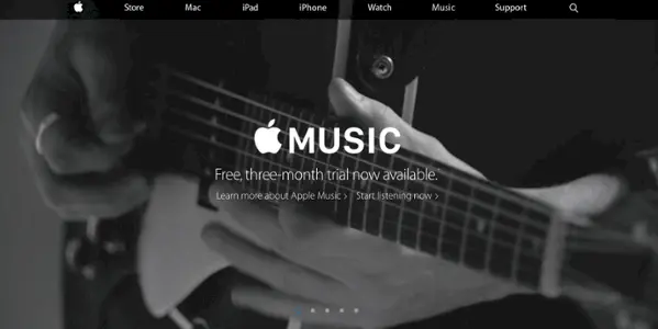
No, not a fella in a cape and underwear on the outside of his trousers, a hero image is a term for a type of web banner. It is a large banner image, displayed prominently on the page, often spanning the entire screen. It can consist of an image and text, can be static or dynamic and is usually an overview or representation of the site as a whole.
Here’s an example of a hero image being used on the Apple Music website...
The saturation of any trend tends to mark the beginning of its downfall, but for us, the most pertinent reasons why hero images are falling out of favour revolve around optimising the user experience.
The problem isn't that large images or videos aren't pleasing, they are. It's that an image doesn't easily convey relevant information to the user. Users wanting artistic photography might go to Instagram. Users that want video content might go to YouTube or TikTok. Users that want your opening hours or to read about the journey of your company want exactly that, and likely don't have much need for the background image or video - regardless of how nice it looks.
One of the largest companies to recently realise this is Airbnb. In the past, Airbnb had a large video as the most dominant feature of their page. Whilst it portrayed their ideal of what a user of their service might enjoy, it didn't perform the main feature a website should be performing - being a channel for information. It's arguable that at its best the background didn't serve any purpose, and at its worst, it was distracting the user from their goal.
Having realised this, their new landing page simply has a catchy tagline, a call to action, and the ability to dive immediately into a search for somewhere nice to stay on holiday. This is exactly why a person will be visiting Airbnb.com in the first place, therefore Airbnb has streamlined its user experience.
Sites like City Observatory have their content playing centre stage, and the site is easy to navigate. The rich content is good for SEO and easy on users who are browsing using 3G/4G (lowering mobile users’ monthly data usage and improving loading times on their devices). As is typical with web design, the majority of decisions revolve around enhancing UX (user experience). Developers are starting to realise that, while the need for aesthetics is important, usability should not be displaced to accommodate it.
Keep up with all our web design tips on our regularly updated blog.
You'll receive an email update every 2 weeks with insight and advice to support you in your digital marketing journey. We treat your email address with care, and you can unsubscribe with just a click.