

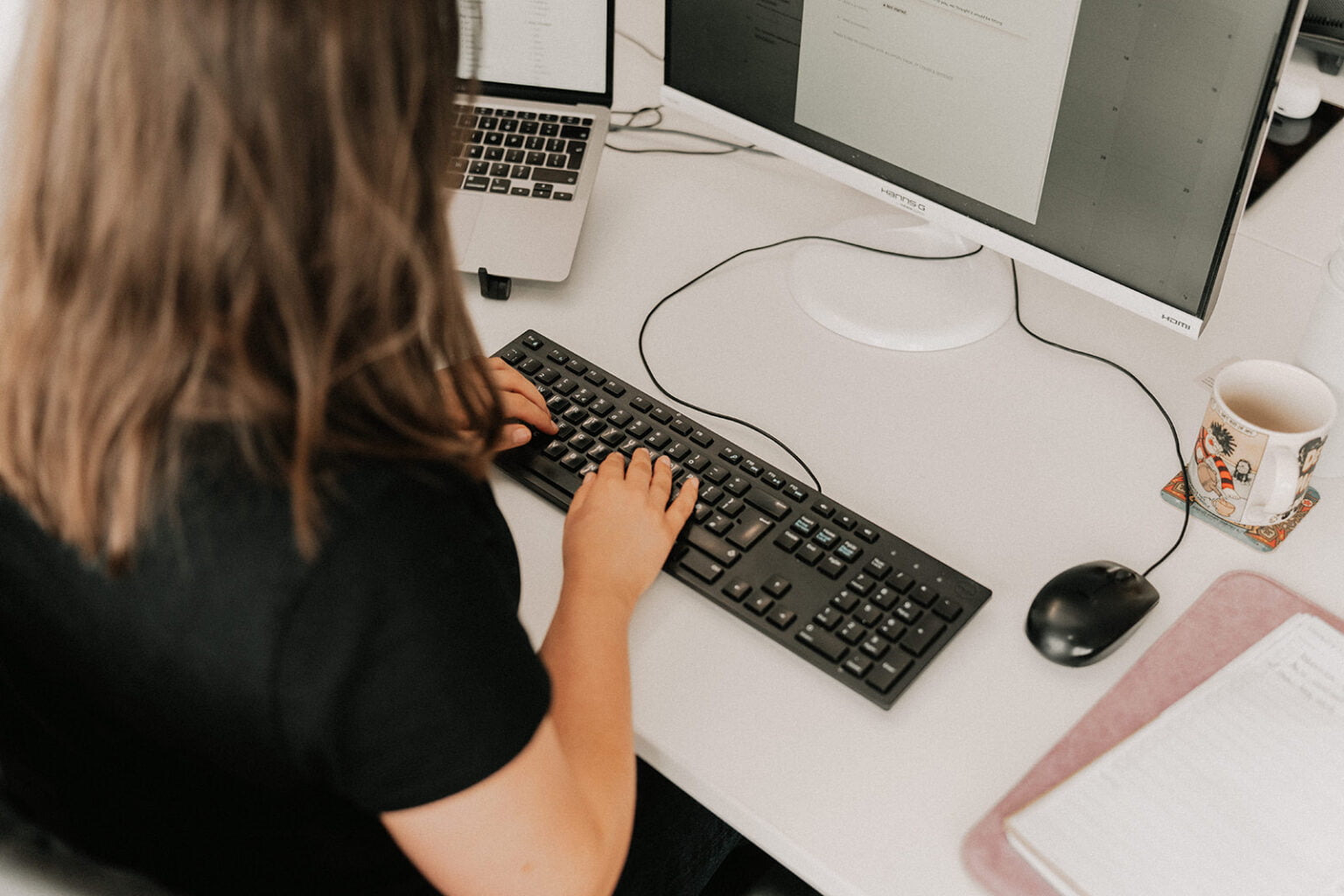
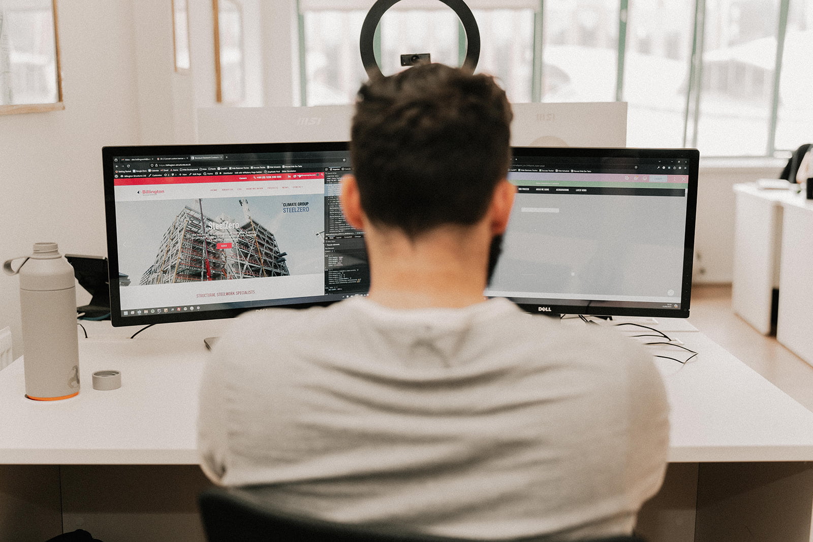
Website design and development trends prioritize user experience. With modern phones all having access to the internet, it is natural to build responsive sites that work on both mobile and desktop.
One of the current leading principles in web design is the method of “build once, run anywhere” – a simple concept whereby developers build an application or website, with the intent of it performing successfully across a myriad of devices. Despite this, we sometimes find that websites, even in the modern day, fail to meet the demand of the varying hardware that can access the world wide web.
Mobile Devices
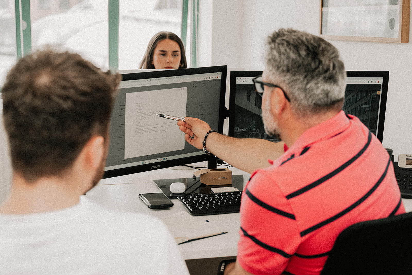
As technology moves forward, so does the number of devices that can access the internet or even devices that are used to interact with your computer. While we may usually assume that any given website will be interacted with solely on a smartphone or laptop, there are instances where this is not the case.
It should go without saying, that a solid approach to increasing accessibility and usability of a website should also serve to increase the strength of your site’s SEO and in turn, increase the ranking of your site amongst the internet’s various search engines, especially since the introduction of Google’s Core Web Vitals. However, when approaching the idea of having and maintaining your corner on the web, there is much more to consider than the computer on your desk and the phone in your pocket.
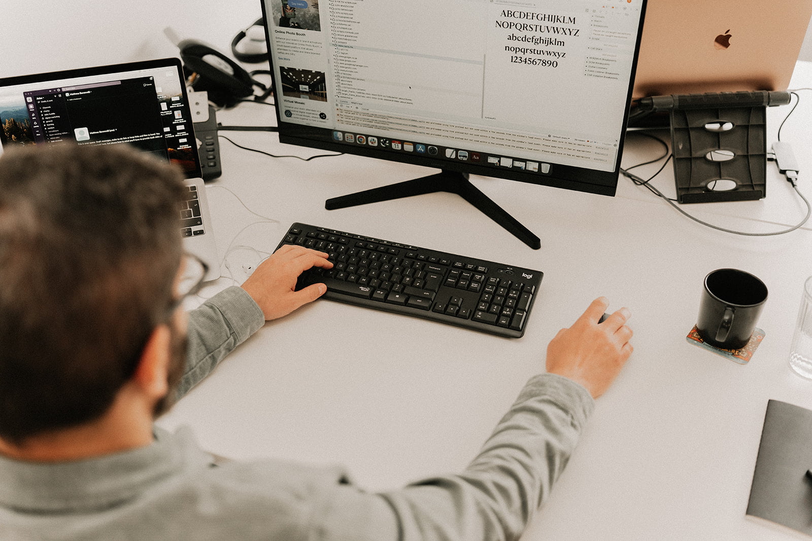
Accessibility Peripherals
For example, those with disabilities might interact with your site using a piece of software or hardware that makes browsing the web more approachable. So, with this in mind, how can we focus efforts on creating a solid user experience for any individual who visits your website?
There are devices that we sometimes do not test with a new website. For example, a pointer is designed and built with the express purpose of simulating a computer mouse’s movement on screen, therefore there is little to no need to keep one to hand when building a website. However, other peripherals such as screen readers would be useful in the testing phase of development, to be sure that image alt tags are being picked up and read to the end user.
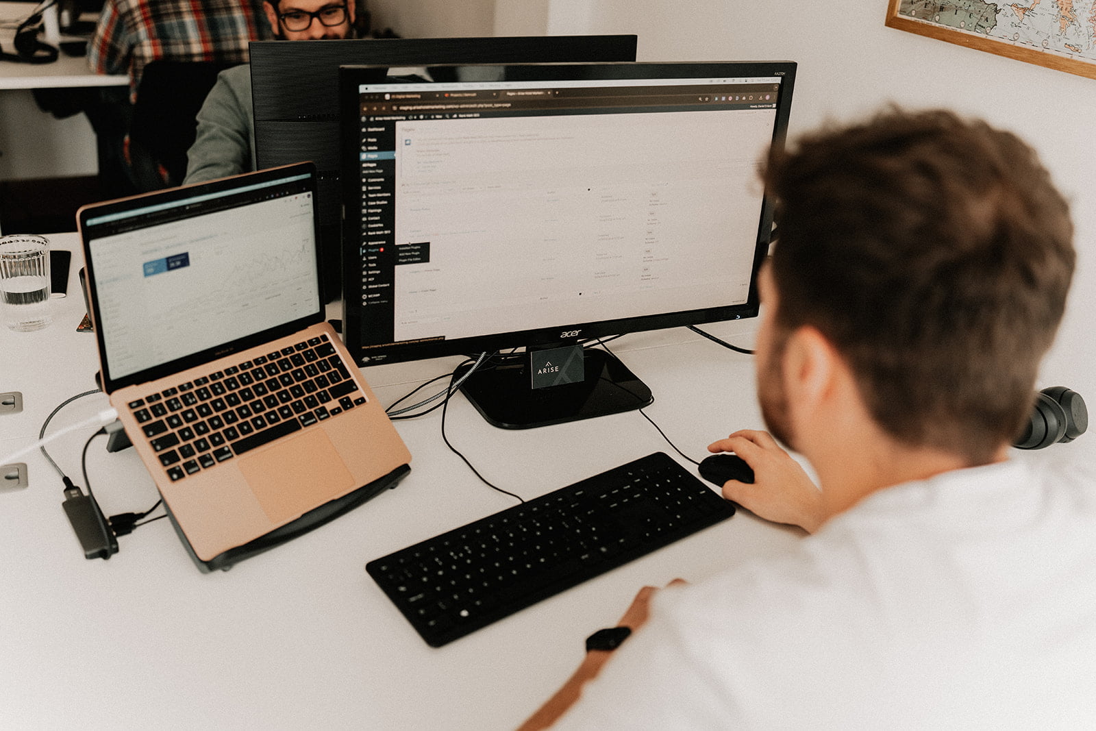
Fun Stuff
Some devices might not necessarily need testing on actual hardware, but sometimes ensuring your site looks good with somewhat outrageous proportions can make a big difference to how people interact with your service.
How does your website look on a smart fridge or a smart watch? Maybe even on a game’s console or TV? According to Statista (2021), 60% of people in the UK accessed the web via smartphone. Therefore it’s unlikely that you’ll find more than 1% of users accessing your site through their fridge. However, can you be sure your competitors aren’t targeting the smart devices such as this?
Build Once, Run Everywhere!
Potential conversions are more than likely swayed by their initial experience with your website. Therefore, by making your service accessible on many devices, we reduce the rate at which potential clients leave your site.
It is imperative then, to approach web design and development with the intent to make the end product accessible on as many devices, and under as many varying circumstances, as possible. We ultimately aim to treat everyone the same, both for potential clients but also for the general accessibility and inclusion of everyone.
For further advice on web design and development, explore our other blog posts or get in touch to discuss your priorities with our team.